톡톡코스메틱의 사회공헌 캠페인 및 봉사활동 TOKTOKCOS Cosmetic Social Contribution Campaigns & Volunteer Activities
‘피부도 마음도 따뜻하게’ 캠페인
톡톡코스메틱은 피부가 민감한 아동과 청소년들을 위해 천연 성분으로 만든 마스크팩과 스킨케어 제품을 정기적으로 아동복지시설에 기부하고 있습니다.
“Warm Skin, Warm Hearts” Campaign
TOKTOKCOS Cosmetics regularly donates natural ingredient-based facial masks and skincare products to children’s welfare facilities, supporting children and teenagers with sensitive skin conditions. Through this initiative, we strive to bring comfort, care, and confidence to young people in need.
‘톡톡한 나눔 박스’ 봉사활동
임직원들과 고객이 함께 참여하는 ‘나눔 박스’ 제작 봉사활동을 통해, 위생용품과 생필품을 포장하여 지역 독거노인과 취약계층에게 전달하고 있습니다.
“TOKTOK Sharing Box” Volunteer Activity
Through the “Sharing Box” program, our employees and customers participate together in preparing care packages filled with hygiene products and daily necessities. These boxes are delivered to elderly individuals living alone and other vulnerable members of the local community, spreading warmth and compassion.
‘지구를 위한 톡톡한 실천’ 친환경 캠페인
재활용 가능한 패키지 사용과 리필 스테이션 운영을 통해 플라스틱 사용을 줄이고, 환경 보호를 위한 대중 인식 제고 활동을 지속하고 있습니다.
“TOKTOK for the Earth” Eco-Friendly Campaign
TOKTOKCOS Cosmetics actively promotes environmental sustainability by using recyclable packaging and operating refill stations to reduce plastic consumption. We also continue to raise public awareness about environmental protection through various eco-conscious initiatives.
‘피부 자신감 프로젝트’ 청소년 자립 지원
피부 고민으로 자존감이 낮은 청소년을 대상으로 무료 피부관리 클래스 및 멘토링을 제공하며, 건강한 아름다움을 통해 자기효능감을 높이는 프로그램을 운영하고 있습니다.
“Skin Confidence Project” – Youth Empowerment Program
This program supports teenagers who struggle with low self-esteem due to skin concerns. TOKTOKCOS offers free skincare classes and mentoring sessions designed to help young people build confidence and develop a healthy perception of beauty and self-worth.
지역사회 연계 미용 재능기부
미용 전문가와 함께 지역 복지관을 방문해 무료 피부상담과 팩 체험을 제공하는 ‘찾아가는 뷰티트럭’을 운영하며 지역사회와 따뜻한 연결을 실천하고 있습니다.
Community Beauty Volunteer Service
In collaboration with beauty professionals, TOKTOKCOS operates a “Mobile Beauty Truck” that visits local welfare centers to provide free skincare consultations and facial mask experiences. Through this outreach program, we aim to strengthen our connection with the community and share the value of care and well-being.
<톡톡코스메틱 가족 일동>
<With warm regards,The TOKTOKCOS Family>
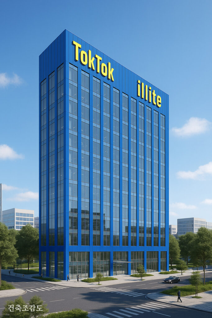
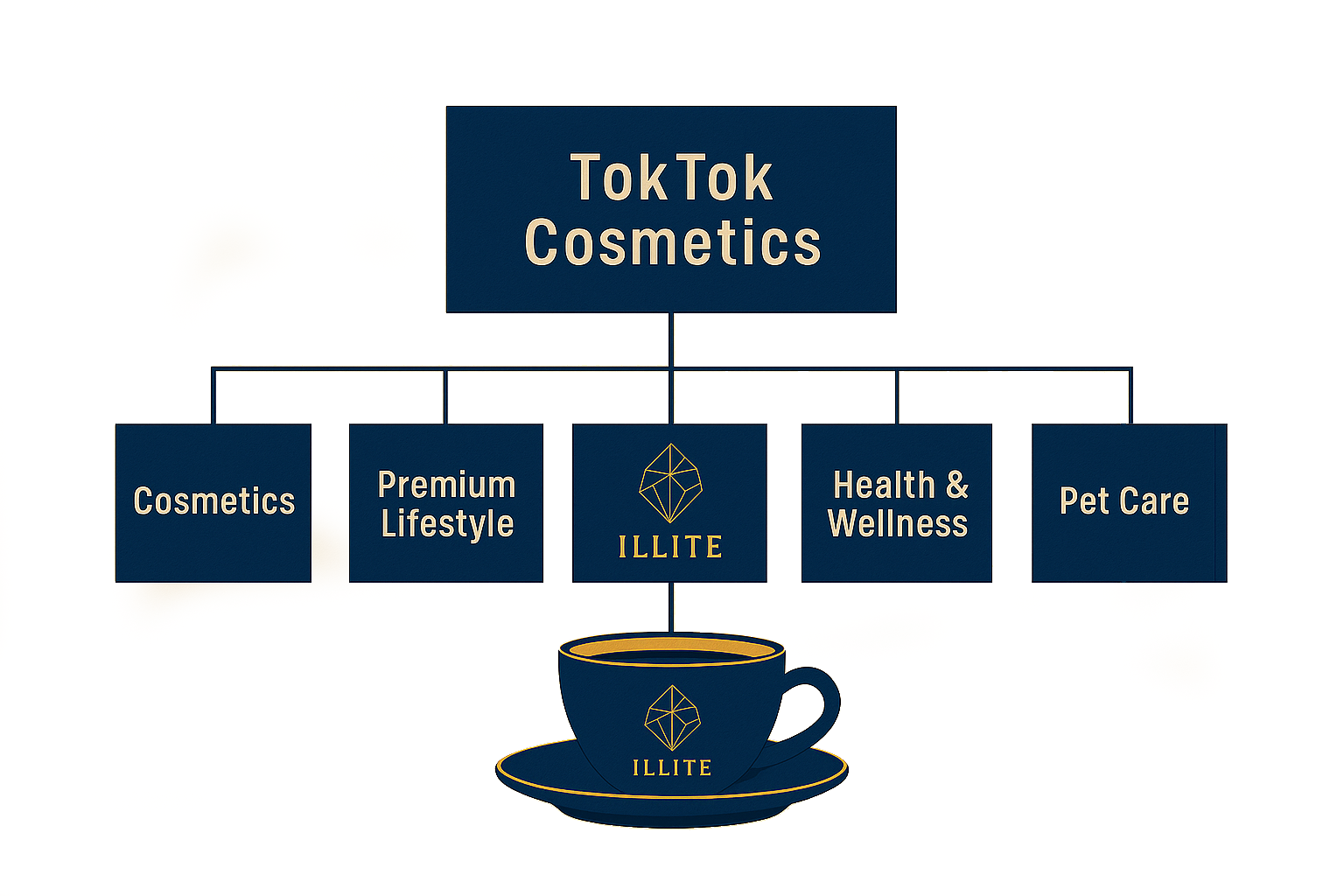
사업분야 Business sector
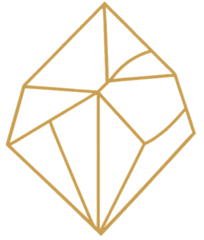
TokTok Illite CI/BI Concept
TokTok Illite의 ci/bi는 일라이트 결정 구조를 기하학적이면서도 우아한 선들로 표현한 형태로,
다각형 구조는 자연의 균형, 반복, 생성을 상징하며, 골드 라인은 고귀함과 치유의 에너지를 내포합니다.
자연에서 비롯된 광물의 질서와 미(美)를 담고 있습니다.
단순하면서도 정교한 선분 배열은 ‘자연의 정수’가 과학과 예술을 통해 정제되는 과정을 형상화한 것입니다.
골드(황금색)는 빛과 생명의 에너지를, 네이비(남색 배경)는 신뢰, 안정감, 자연의 깊이를 상징합니다.
이는 곧 TokTok Illite가 추구하는 철학인 “자연의 본질로부터 오는 치유와 회복의 아름다움”을 시각화합니다.
The CI/BI of TokTok Illite is designed by expressing the crystalline structure of illite through geometric yet elegant lines.
The polygonal structure symbolizes the balance, repetition, and generative power of nature, while the golden lines embody nobility and the energy of healing.
This design reflects the inherent order and beauty of minerals derived from nature.
The simple yet precise arrangement of line segments represents the process through which the essence of nature is refined and transformed through science and art.
The color gold symbolizes light and the energy of life, while the navy background represents trust, stability, and the profound depth of nature.
Together, these elements visually express the philosophy of TokTok Illite:
“The beauty of healing and restoration that originates from the essence of nature.”
TokTok Illite Healing CI/BI 색상 분석
main colors

Healing Blue (PANTONE 2728C) HEX #0076D6 RGB(0, 118, 214) CMYK(100, 45, 0, 16)
역할: 브랜드의 강렬한 첫인상, 시원하고 청결한 느낌 강조 (Role: Creating a Strong First Impression while Emphasizing a Fresh and Clean Image)
상징 의미: Symbolic Meaning
청정함(Cleanliness)
신뢰(Trust)
자연 속 순환의 물(Water from Nature’s Cycle)
사용 위치: 제품 패키지 배경 색상( Placement: Product Packaging Background Color)

Illite Yellow (PANTONE 102C) hex #FFE100 RGB(255, 225, 0) CMYK(0, 12, 100, 0)
역할: 활기와 생명력을 전달하는 포인트 컬러 (Role: An Accent Color that Delivers Vitality and Energy)
상징 의미: Symbolic Meaning
에너지(Energy)
햇살(Vitality)
치유(Healing Power)
사용 위치: “HEALING SOAP” 타이포그래피 및 로고 강조 색 (Placement: Accent Color for “HEALING SOAP” Typography and Logo)

Natural Ivory (PANTONE 11-0907 TCX) hex #fffff0 RGB(255, 255, 240) CMYK(0, 0, 6, 0)
역할: 비누 자체 색상, 자연 그대로의 순수함을 표현 (Role: The Soap’s Natural Color, Expressing the Purity of Nature)
상징 의미: Symbolic Meaning
순수함(Purity)
편안함(Gentleness)
피부 본연의 톤(Skin’s Natural Tone)
사용 위치: 제품 실물, 비누 바디 (Placement: Product Surface,Soap Bar)
sub colors

Royal Navy (PANTONE 282C) HEX#041E42 RGB(4, 30, 66) CMYK(100, 90, 13, 68)
철학적 의미: 뷰티 제품의 과학적 효능과 안정성을 상징, ‘피부에 믿음을 준다’는 메시지 (Philosophical Meaning: Symbolizing the Scientific Efficacy and Stability of Beauty Products, Conveying the Message of “Trust for Your Skin.”)
역할: 브랜드의 고급스러움과 안정감 부여 (Role: Enhancing the Brand’s Sense of Luxury and Stability)
상징 의미: Symbolic Meaning
신뢰(Trust)
전문성(Professionalism)
고급 감성(Premium Feel)
사용 위치: 외부 박스 배경색 (깊은 네이비 톤) (Placement: Outer Box Background, Deep Navy Tone)

Champagne Gold (PANTONE 305C) hex#D5B887 RGB(213, 184, 135) CMYK(0, 14, 37, 16)
철학적 의미: 일라이트의 자연광채와 고급 원료의 가치를 은유 (Philosophical Meaning: Representing the Natural Radiance of Illite and the Value of Premium Ingredients)
역할: 브랜드 로고 및 타이포그래피 컬러 role: Brand Logo and Typography Color
상징 의미: Symbolic Meaning
우아함(Elegance)
빛남(Glow)
브랜드의 클래식함(Classic Sophistication)
사용 위치: 텍스트(로고, 설명 문구), 패키지 테두리 (Placement: Text (Logo, Description), Package Border)

Silk Beige (PANTONE 9161C) hex #E8D9C4 RGB(232, 217, 196) cmyk(0,7,16,9)
철학적 의미: 피부에 직접 닿는 제품의 순수성과 안전성을 강조 (Philosophical Meaning: Emphasizing the Purity and Safety of Products that Come into Direct Contact with the Skin)
역할: 마스크팩 파우치 배경 컬러 (Role: Background Color for the Mask Pack Pouch)
상징 의미: Symbolic Meaning
부드러움(Gentleness)
청결함(Clean Finish)
자연주의(Naturalism)
사용 위치: 개별 마스크 포장 배경 (placement: Individual Mask Packaging Background)